Categories
Uncategorized

Chuck Taylors Sketch

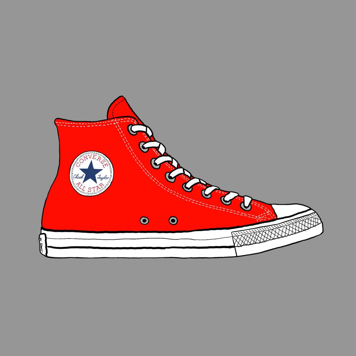
Did I have Chuck Taylors when I was a kid? Of course I did. Do I have a pair now? Yeah, I do. I remember learning about Chuck Taylor (the man) and finding out he was sort of the first “shoe evangelist”, as it were. You can learn more about Chuck on Wikipedia.

Of course if you just want to learn about the shoes, you can do that too. The pair I have now, I definitely don’t wear every day. I think Chucks are much better for young feet than for someone who has been around over four decades. (Or maybe that’s just my feet talking.)

Anyway, I’m sure I’ve seen hundreds of skaters and punk kids wearing Chucks over the years, and then they got even more popular and normies started wearing them. I guess that’s just how it goes, eh?

So pour one out for Chuck whose was born on June 24th, 1901 and died on June 23rd, 1969… just five days after I was born.

Side story here, when we lived near a cemetery (last time, not this time) we always looked at death dates and birth dates to see if people made it to their birthday. Sadly Chuck died the day before his birthday! So close!!!

I’ve mentioned it before, but I do these sketches with an Apple Pencil on an iPad using Procreate. If you want a print of one of these, or a color I didn’t do, let me know and we can work something out.

Categories
Uncategorized

Traffic Cone Sketch

This sketch was inspired by a few things. My walking (and now biking) puts me out on the streets a lot, and my recent interest in fixing potholes has made me more aware of street conditions in Milwaukee.

There are also two artists that use traffic cones in their work. Sarah Davitt is a friend (and Milwaukee Makerspace member) who uses cones in her work. (She even gave me a traffic cone print.)

Cynthia Connolly is an artist and photographer. Her book Banned In DC is amazing and she’s the artist who did Minor Threat’s Out of Step album cover art. (She’s also posted a few cones.) There’s also a set of Postcards of Cones Along Highway 1 (which you can purchase).

As always (at least lately) this sketch was created with an Apple Pencil on an iPad using Procreate. I also threw in a shot of the sketch on top of the photo, which I think is a fun look.

Categories
Uncategorized

Sleep Report [New Machine]

I figured it was time to do another sleep report since I’ve had the new CPAP for a while now and it’s been over six months the last report.

First of all, the new CPAP is way better than the old (failing) one the insurance company refused to replace. It’s easier to use, provides better stats, and is a bit smaller as well. All good there.

I’ve averaged 6 hours 32 minutes of use per night for that past two months. I missed one night of use due to being unexpectedly stuck in Chicago overnight on March 9th, and it looks like March 18th was a short usage night but I was also on the road so that might be why. But also, there were two night I got over 8 hours… which is nice, because it’s not a regular thing.

(I also just notices all the times are wrong! I probably missed a setting in OSCAR when I created a new profile for the new machine.

Anyway, I am thankful I finally got a new machine, it seems to work great, and I look forward to better sleep!

Categories
Uncategorized

Road Scenes

I took the toy camera along on a walk a few weeks ago here in Enderis Park and I recently printed a few of the photos. I wanted to see how they would look scanned and digitized so I grabbed three of them that were shot in a sequence.

Mind you, when they were printed from the camera they were in a long horizontal strip side-by-side but after scanning them and manipulating them I decided to stack them vertically, and was pleasantly surprised at the composition I got. I feel like it’s not often I am just “messing around” and do something that makes me pause and go “Wow”, but that’s what happened this time.

Somehow, probably due to the tonal match of the thermal prints, this fits together really well! It looks like a single scene to me, and that’s pretty neat.

Here’s the three shots separated slightly so you can better see how they stand on their own.

I thought this was a bit magical, so I wanted to make note of it. I may need to experiment with combining multiple prints in other ways to see if I can make this happen again.

Categories
Uncategorized

Visit Milwaukee Logo

Visit Milwaukee has rebranded, and introduced a new logo. You can check their site for more info, or see the comments from the people on Facebook.

Disclaimer: I have a degree in Graphic Design, and though I’ve never held a job with the title Graphic Designer, I’ve done a lot of design, and seen a lot of good (and bad) design over the years. I’ve also worked with some very talented designers over the years. (And I’ve written about logos before.)

With that out of the way, I will say… good logo design is hard. Like, really hard. Extremely difficult. Rebrands are also challenging because there will always be people who don’t like change, or just prefer the old thing they are familiar with.

So what are my thoughts on this new logo? It’s fine. I don’t love it, but that’s okay. I think it’s recognizable and memorable, and when I see it in the future I’m recall what it is, what it’s for, and than it’s part of Visit Milwaukee.

Would I purchase merchandise with this logo on it? Probably not, but it depends very much on the application of it, and the context. I’m definitely not a huge fan of this logo. I do really like The People’s Flag of Milwaukee and I still like Milwaukee Home (though I feel they cheapened the brand when it expanded to other cities).

Overall I think the new design direction of Visit Milwaukee is good, and I look forward to seeing how it progresses over time. There’s even a chance this logo will grow on me and I’ll come to like it more than I do right now. We’ll see!